The House On Main Street-Monticello, IL
If you’ve followed us on this journey of our “House on Main” flip, then you know this has been QUITE the transformation! We spotted this house almost TWO years ago and right away Guy knew it would be the perfect flip property for us. It wasn’t until THIS April that we finally got to put that potential to the test and watch our late night vision board come to life.
We spent so much time in this house, envisioning and re-envisioning every square inch of this house and to see it completed is like watching a dream coming true. Thank you to everyone that supported us throughout this process. We could not have done it without the constant encouragement and love from so many family and friends!
Just scroll through these before and after pictures to see how this house truly came to life over the course of the 5 months we worked on it and see all the products, paint colors, and DIY’s we used to make this home come to life.
The House On Main Street-Monticello, IL
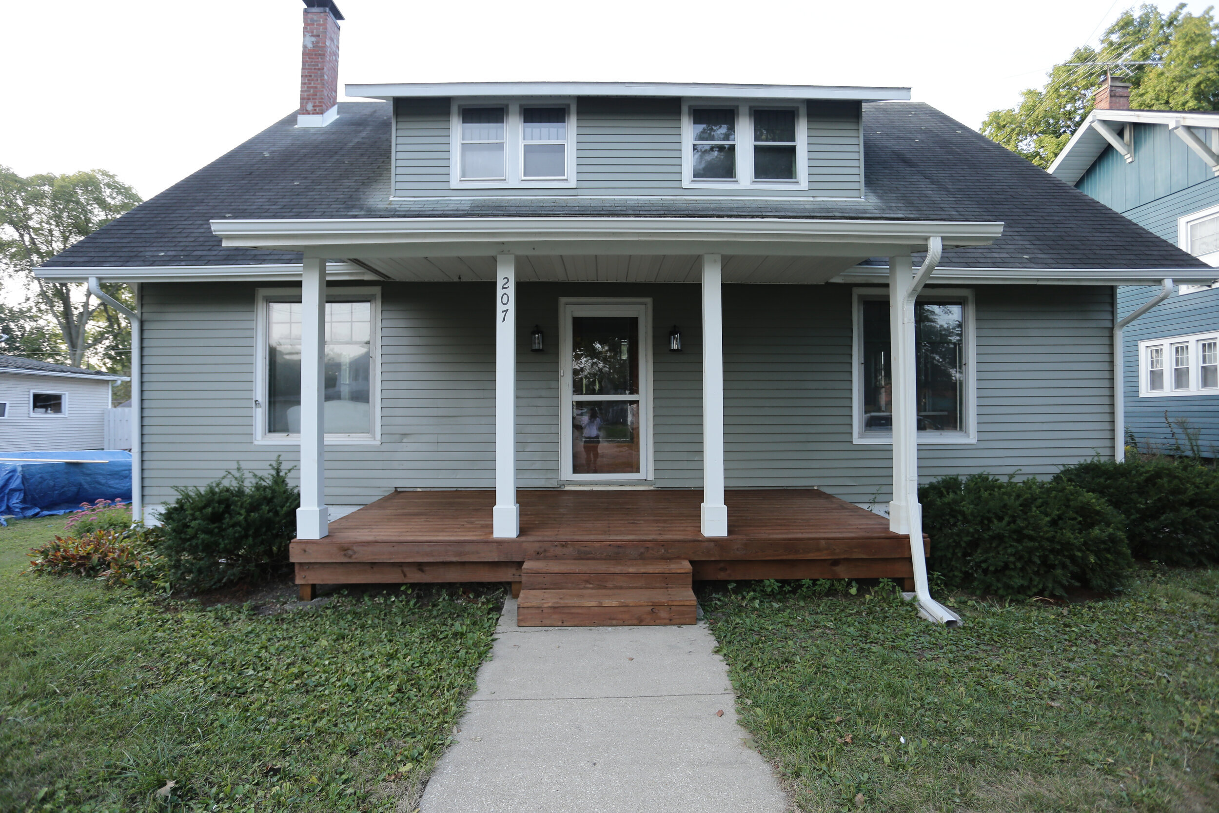
The exterior alone was an enormous transformation. We went with Storm Cloud Gray by Sherwin Williams and used Pure White by Sherwin Williams for the pillars. For the deck stain we went with a semi-transparent exterior stain from Pittsburg Paints in the color Cedar.
ENTRYWAY


This entryway was so fun to re-envision. We ended up replacing the floor with a 12x24 concert looking porcelain tile that we found at Floor & Decor and we set it in a basketweave pattern that really made it stand out from other 12x24 tile layouts. For the walls we used Pure White by Sherwin Williams, in an eggshell finish and for the trim we used SW Pure White in a high gloss finish.
LIVING ROOM


Refinishing this floor is obviously one of the biggest transformations. It completely changed the way this house feels; it brightened it, opened it up and made the whole house flow together. If you missed how we refinished these floors you can check out this video below:
DINING ROOM & KITCHEN


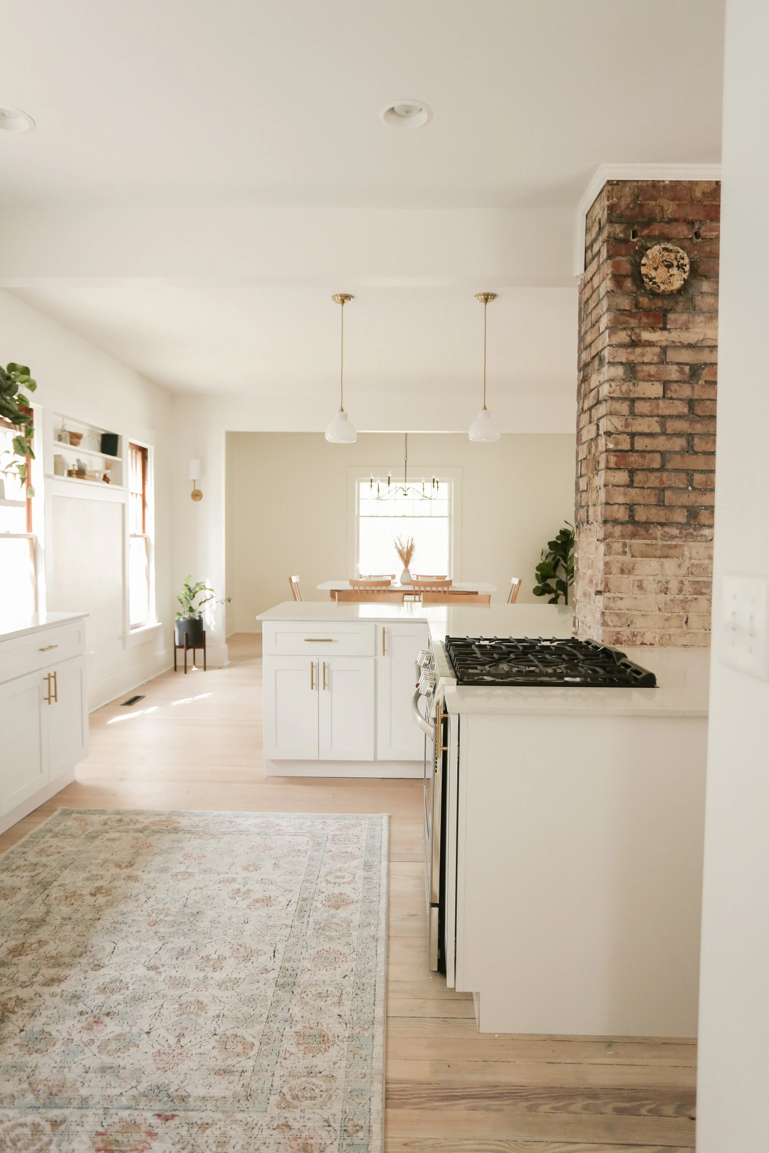
This room was one of my favorites to design. There was so much thought and time that went into making this layout possible. Including installing a separate A/C unit to the second floor so we could have this open floor concept. The brick pipe chase is something we uncovered when taking down this wall and it was something we just couldn’t part with. Brick has somewhat become our staple when it comes to flipping old homes. And do you see those French doors? We obviously took those out when we took down that wall but keep scrolling and you might just see them used in another part of the house!
MORE KITCHEN


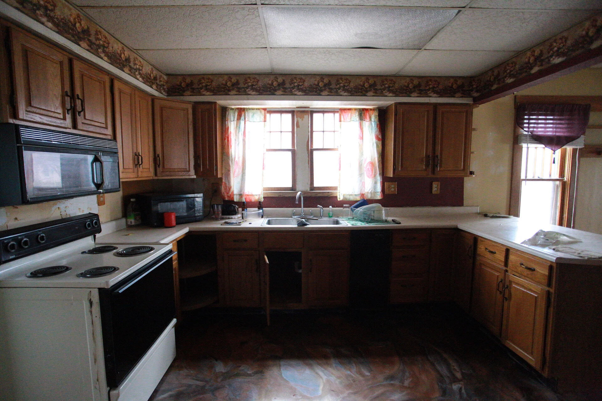

This kitchen renovation will probably be forever one of my favorite transformations! This vertical shiplap, the open shelving, the exposed brick and the marble quartz countertops (OH MY!). It all seemed to come together so perfectly. We used SW Pure White throughout the entire house both on the trim and walls (just in different finishes).
FIRST FLOOR BEDROOM


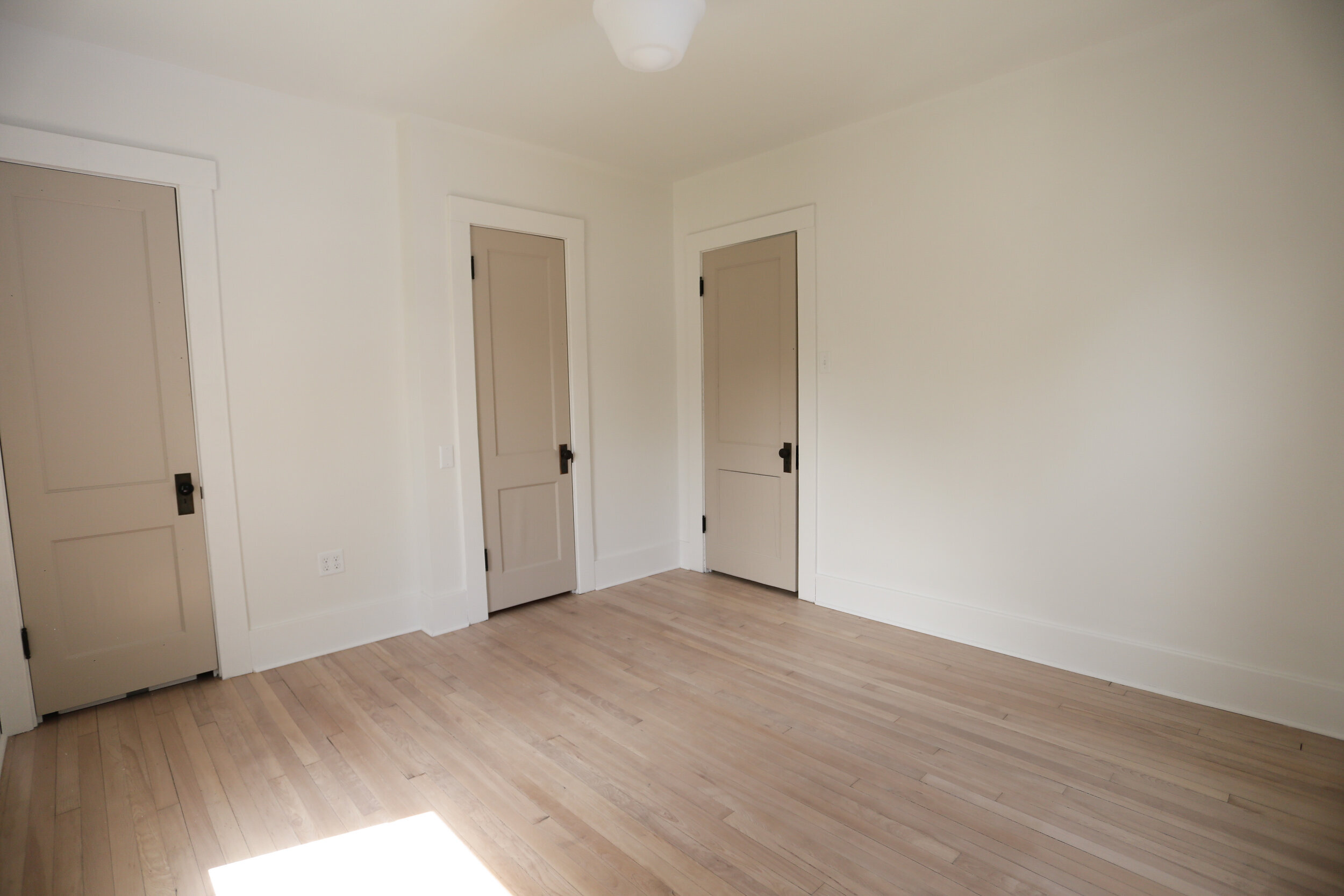
The first floor bedroom got a much needed facelift with a framed in closet and door. The paint on all the interior doors is Smokey Taupe by Benjamin Moore.
BUTLERS PANTRY


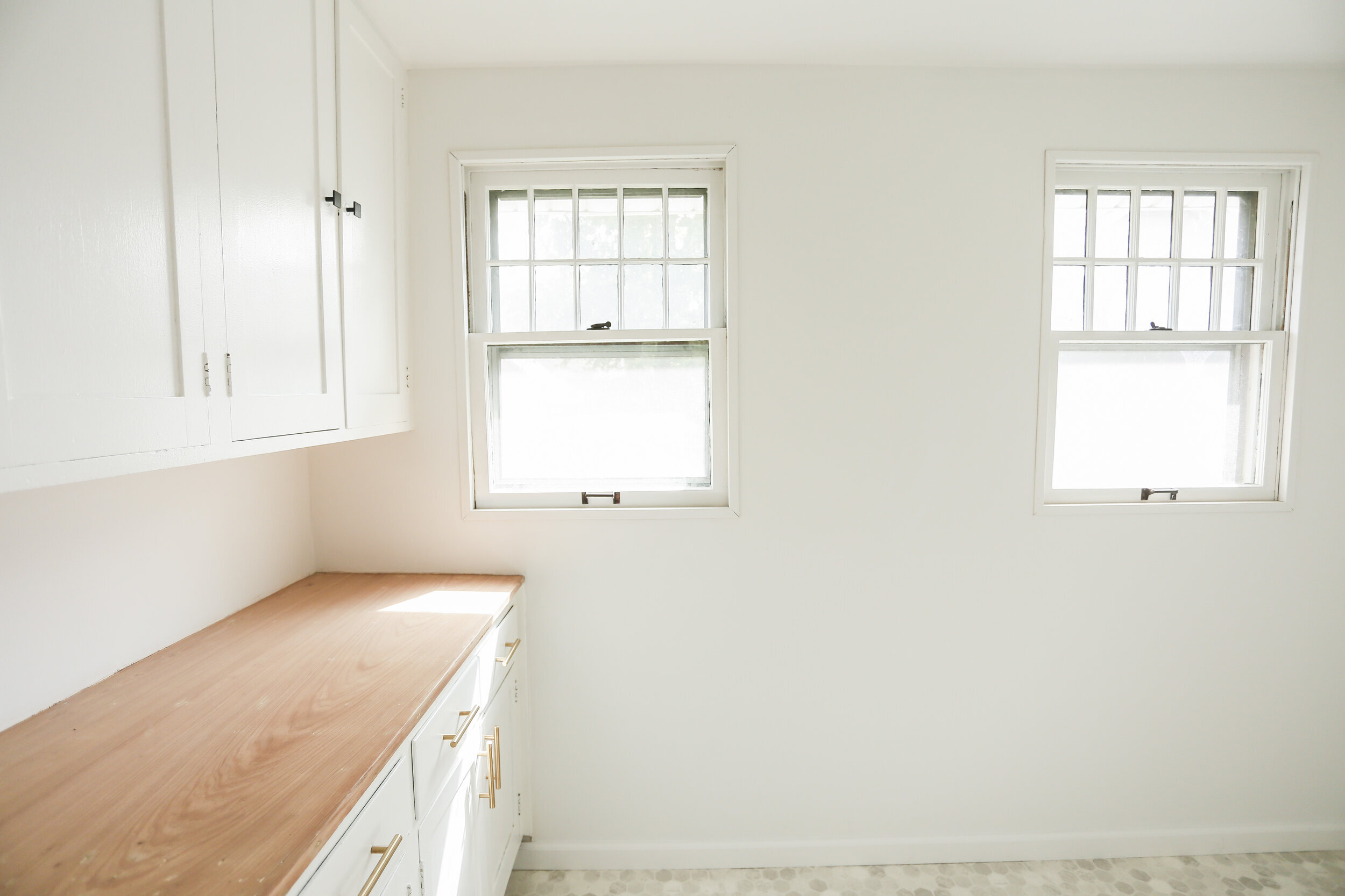

The butlers pantry tucked behind the kitchen had one MAJOR transformation. We painted the cabinets, replaced the flooring, ripped out that awful paneling and brightened up this entire space with a little paint! Oh the wonders of paint!
UPSTAIRS BATH #1


When we bought this house, the upstairs was completed gutted which was really fun to reimagine. We got to add another FULL bath to this home and create functional living spaces. For this large bath we did white 10” hexagon tile with white grout and for the shower we did 4x8 subway tile in a basketweave pattern with a light gray grout. You can shop these arched mirrors HERE. You can shop the sconces HERE. You can find this floating trough sink HERE.
MASTER BEDROOM


The bones of this master bedroom were SO amazing when we bought the house we couldn't wait to drywall it in and watch it come to life! We opened up the closet to make it a little more functional (Hey there French doors! Did you catch that??). We repurposed the French doors from the downstairs and put them as the closet doors in here. And we moved the doorway to access the bathroom from the hallway to the master bedroom. We love how they look in here!
MASTER BATHROOM


We didn’t change anything structurally when we bought this house up here. And since it was already all framed in we had little wiggle room which is why this master bathroom ended up being on the smaller side. But we absolutely loved how it turned out. We used this octagon & dot white and black tile with a white grout. And in the showers we used a 3x6 white subway tile in a diagonal herringbone pattern with white grout. You can find this vanity light HERE.
Upstairs Bedroom #2


This long and skinny south facing bedroom was my FAVORITE!! It held so much character and potential! HERE are the sconces we used for this little bedroom. And the hanging pendant lights HERE.
UPSTAIRS BEDROOM #3


UPSTAIRS HALLWAY/STAIRWELL


Opening up this staircase was one of the biggest transformations of the whole house. It not only elevated the entire look and feel of the flow from the downstairs to the upstairs but it brightened everything up!
And that’s all folks! Longest blog post ever but jam packed with so many great before and afters. I hope this was inspiring to you as it was for us to create it. Please keep coming back here, we are always wanting to encourage you no matter what home ownership journey you’re on!
Did You Know?
We’re a design to build team located right here in Champaign, IL! Want to renovate your home?? Let’s Talk!

