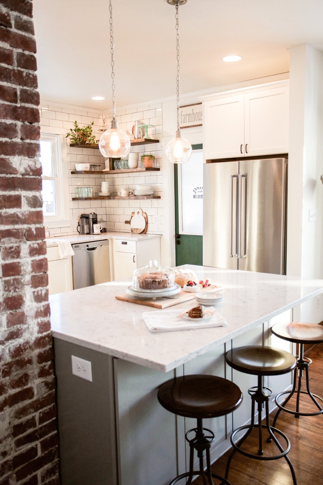
Our Restored Farmhouse Kitchen Reveal

2017 has been a year for the books, I am amazed at all that transpired in such a short amount of time. But what I’m most amazed by is our total kitchen renovation. If you’ve been following our journey for a while now, then you know that in July we stumbled upon a 100 year old farmhouse, and in September we were moving in and starting a complete renovation of the small 10’x10’ kitchen [PROGRESS PICS HERE & HERE].
What many of you don’t know, is that during that time, we teamed up with Lowes Home Improvement to complete that task! From start to finish, we worked with them on reassessing, reconfiguring and re-designing the entire space. They gave us the tools and assistance we needed to make this kitchen the show stopping space it is today.
But before we show you the reveal, let me first remind you what this space used to be.
OUR RESTORED FARMHOUSE KITCHEN REVEAL

The room this picture was taken in is the dining room, and behind this wall is the 10x10 kitchen. Our desire was to make the most out of this space by knocking out this wall and creating an open concept feel, while still keeping the character of the home in tact.
The existing dining room is shown below and was a beautiful open space, accompanied by an expanding window seat that lined the entire wall.
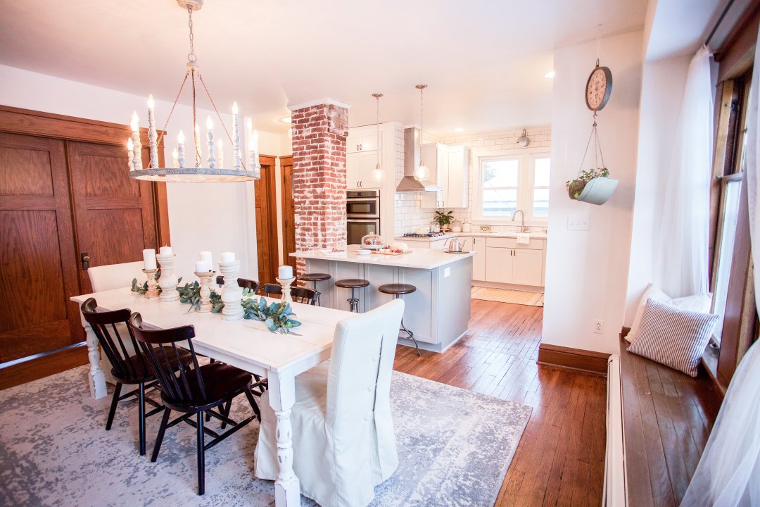
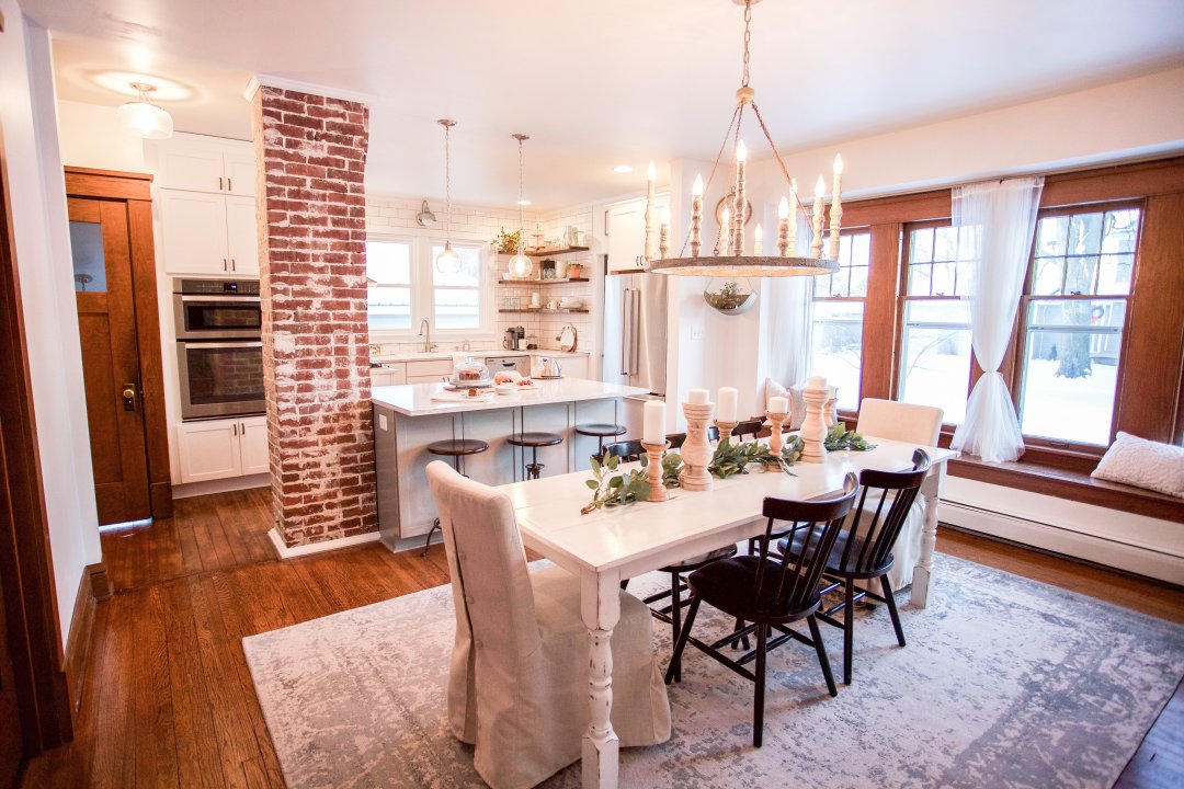
And this is what it looks like now!
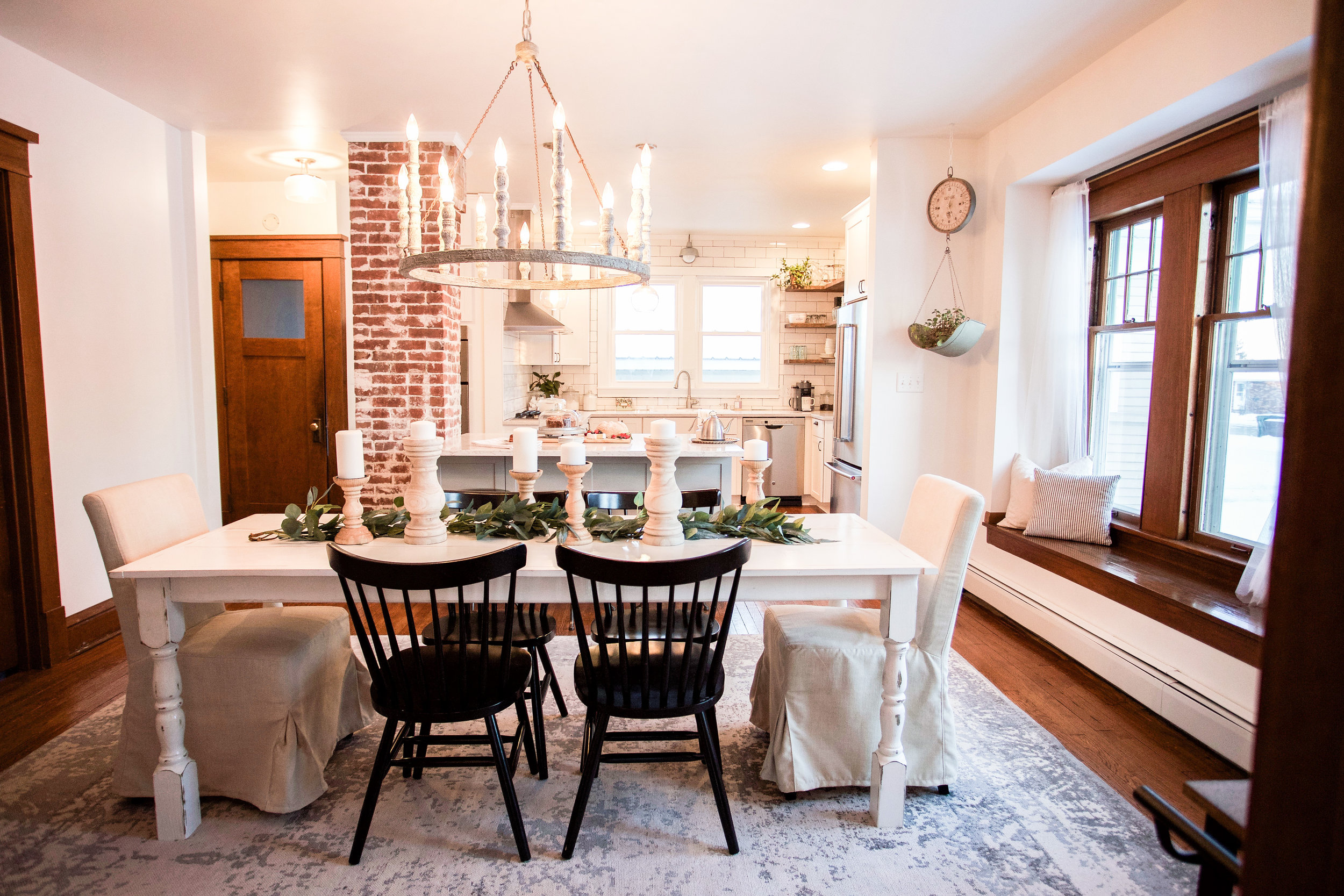
Here's an old picture of what the dining room looked like before:


And this is what it looks like now:


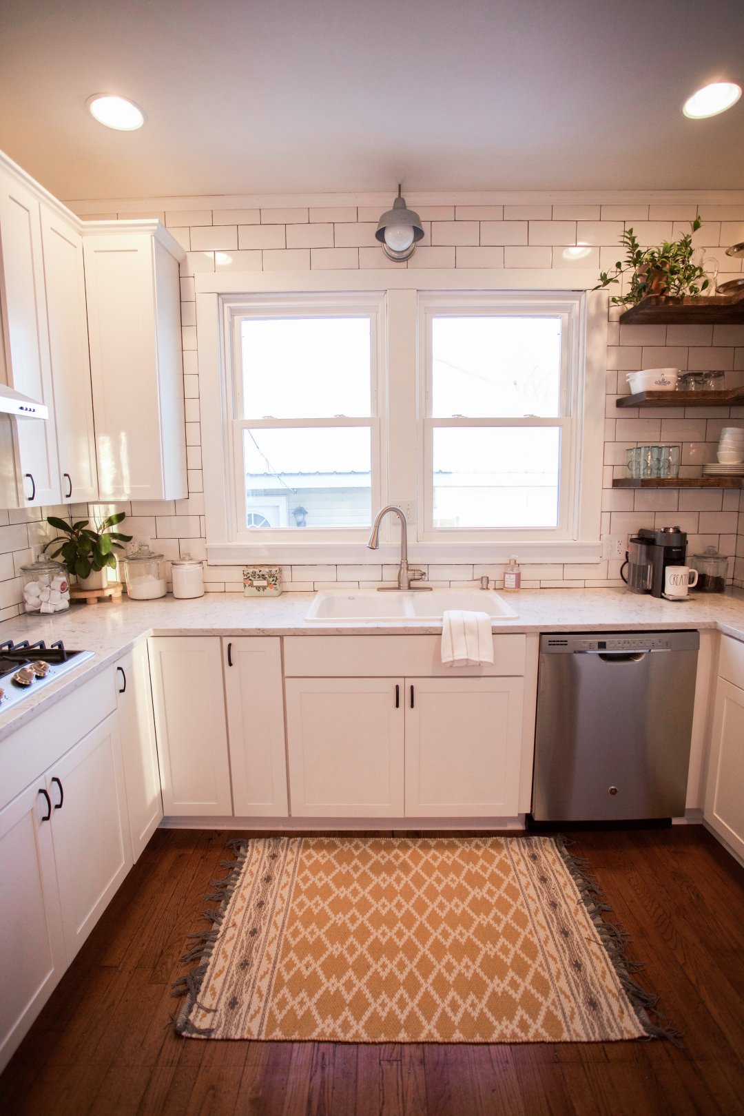
And here is a look inside what our kitchen used to look like (from all angles) and what it looks like now!


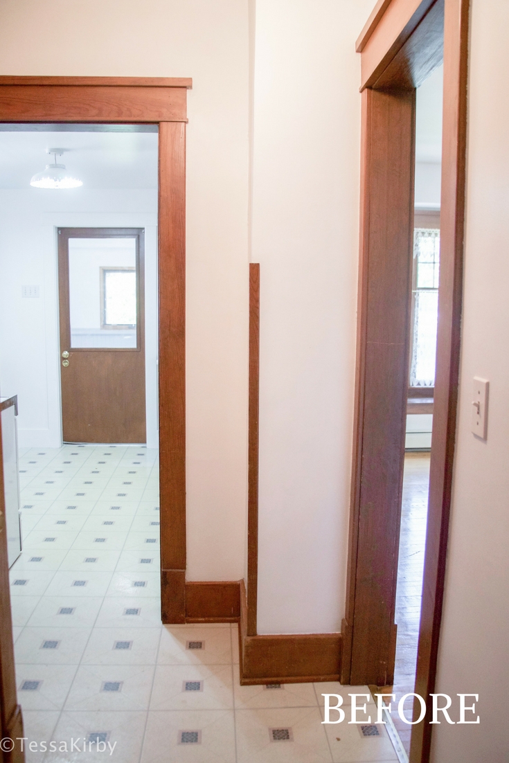


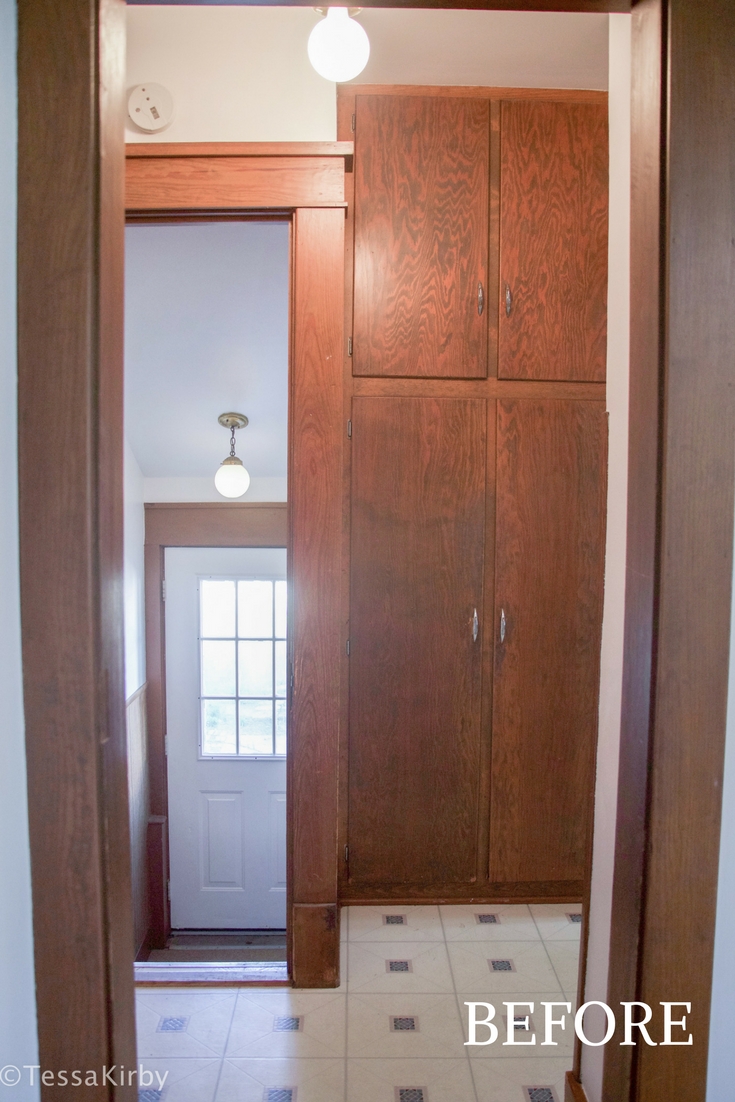
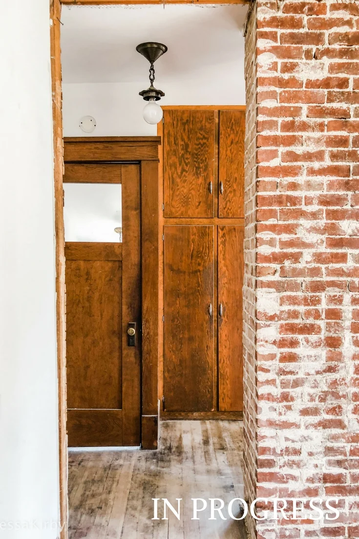
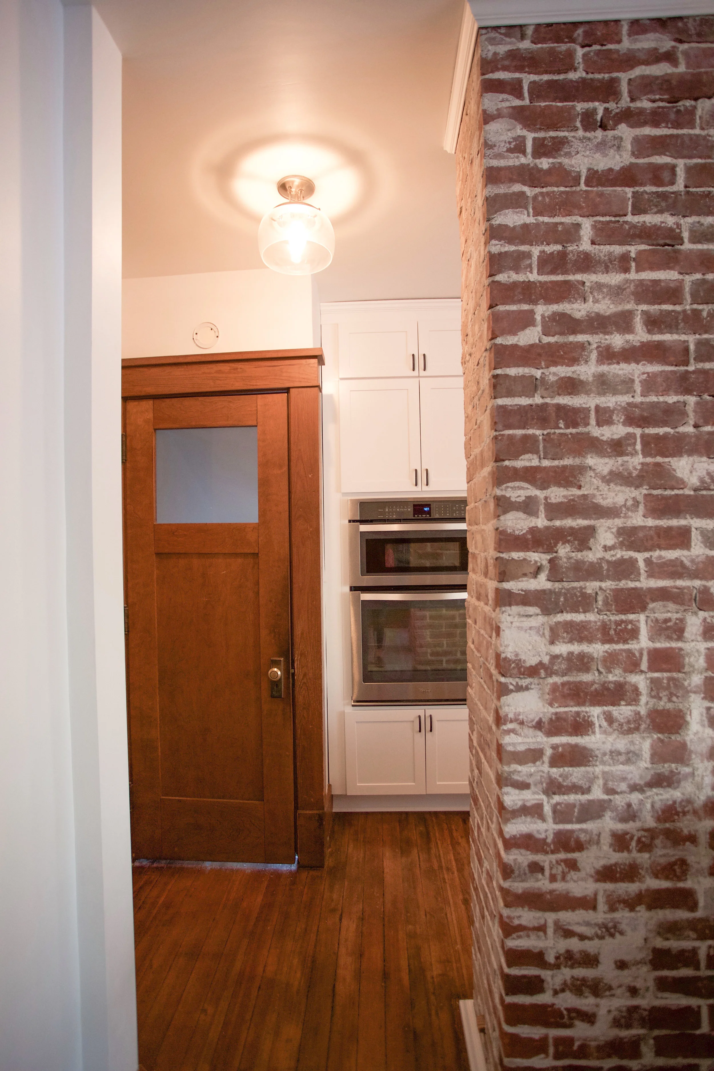
There is obviously a TON that has changed about this space and while I wish I could cover them all, today I mainly wanted to show you all the glorious after pictures and cover the materials that we used from Lowes!
CABINETS
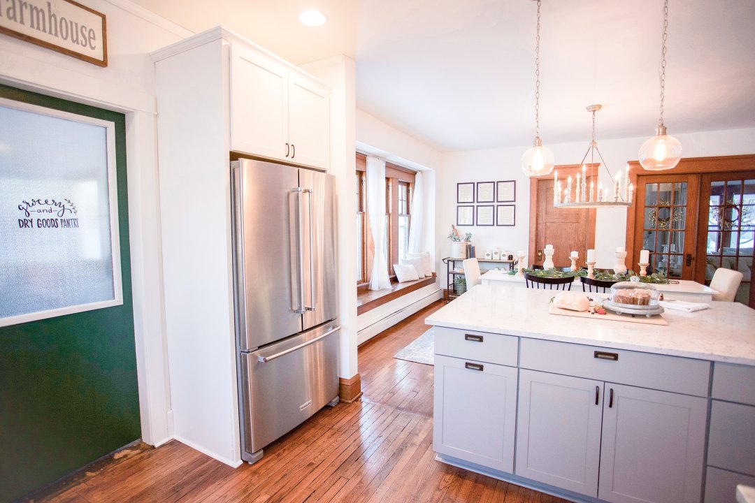
Let's start with the cabinets...as you all probably know by now, I am a sucker for white, which is the color cabinet we used in the last two houses we refinished. However this time around, we wanted to tie in something a little different! So for our island we decided to go with the painted maple shaker cabinets in a light gray color (color: cloud gray).


Cabinets are tricky because there are so many to choose from, and at Lowes they make sure to give you a wide variety! We chose to go with the shaker cabinets in the painted wood from their Diamond series; we liked the idea of having solid wood cabinets and the fact that their drawers had the dovetail design made our choice that much easier.
We absolutely love how this cloud gray island compliments the rest of the white cabinetry and quartz countertops.

COUNTERTOPS
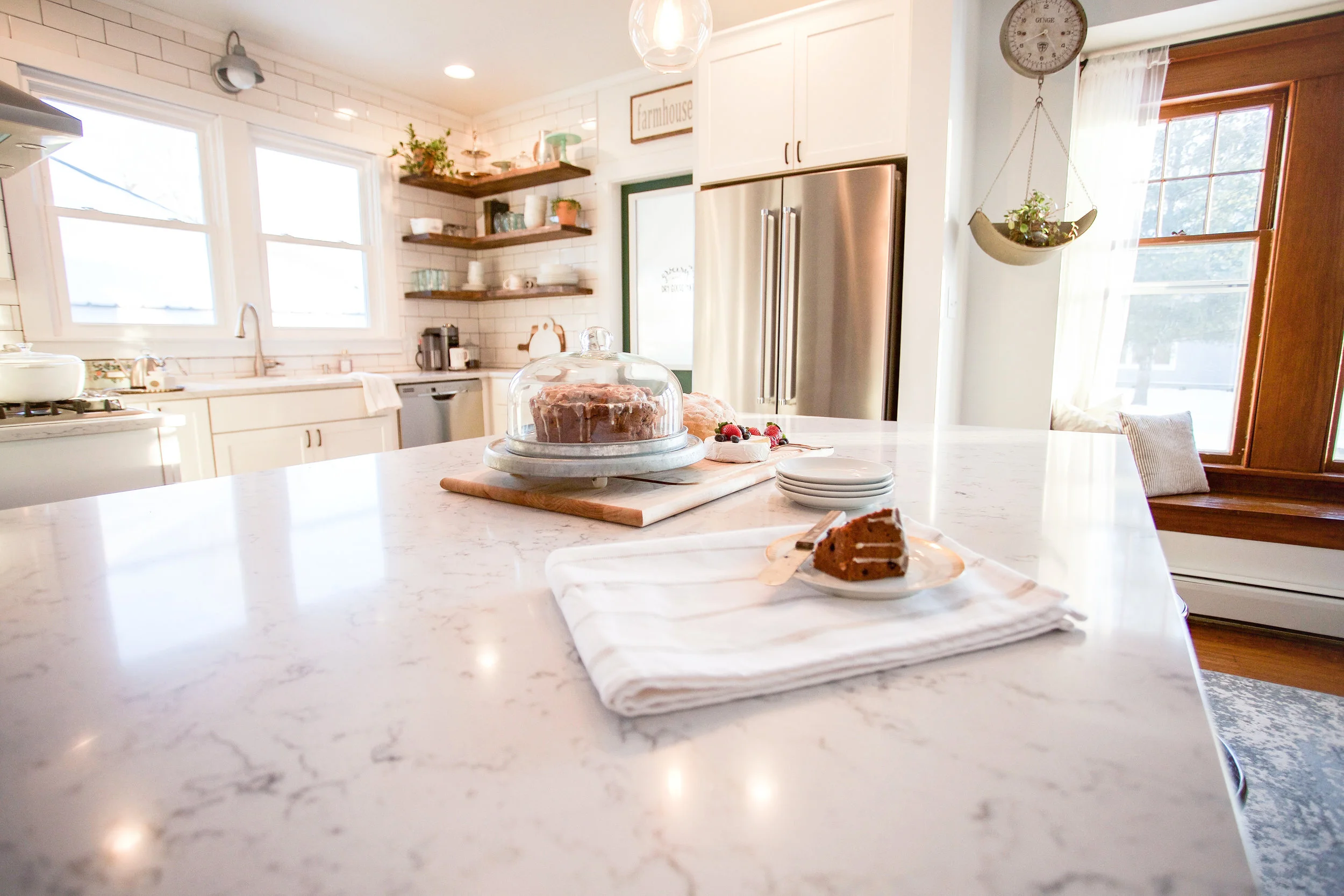


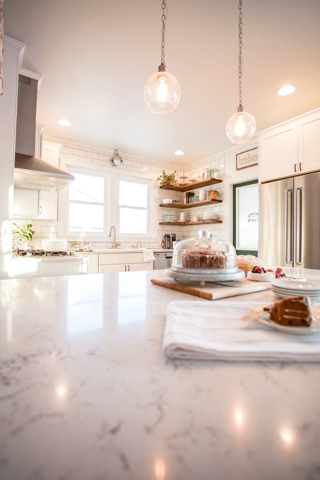
When picking out our countertops, we knew we wanted to go with quartz. We had researched a lot and felt that quartz was the best option both financially and durably. Quartz is a man-made material that utilizes real quartz to look & feel like actual quartz. It's a non-porous material so it can withstand those nasty tomato, chicken, or coffee juices you don't want attaching themselves to those high trafficked surfaces.
We wanted to go for a more "marbly" look so the countertop we picked out is the Lyra quartz countertop from Silestone; which has a bunch of small dark veins running through it that creates a subtle yet dramatic effect; it enhances the dark grout lines and pulls out the gray in the cabinets that much more. Isn't it just so beautiful!?
APPLIANCES
For the appliances you may have noticed that we added a few more bells and whistles than we have in the past. First, we opted for a counter depth fridge since the walk-way between the fridge and the island is pretty tight to begin with; since living in our first flip house we became suckers for french door refrigerators; so going with this Kitchenaide 20-cu ft counter depth french door fridge gave us the space we needed while still achieving the look we wanted.
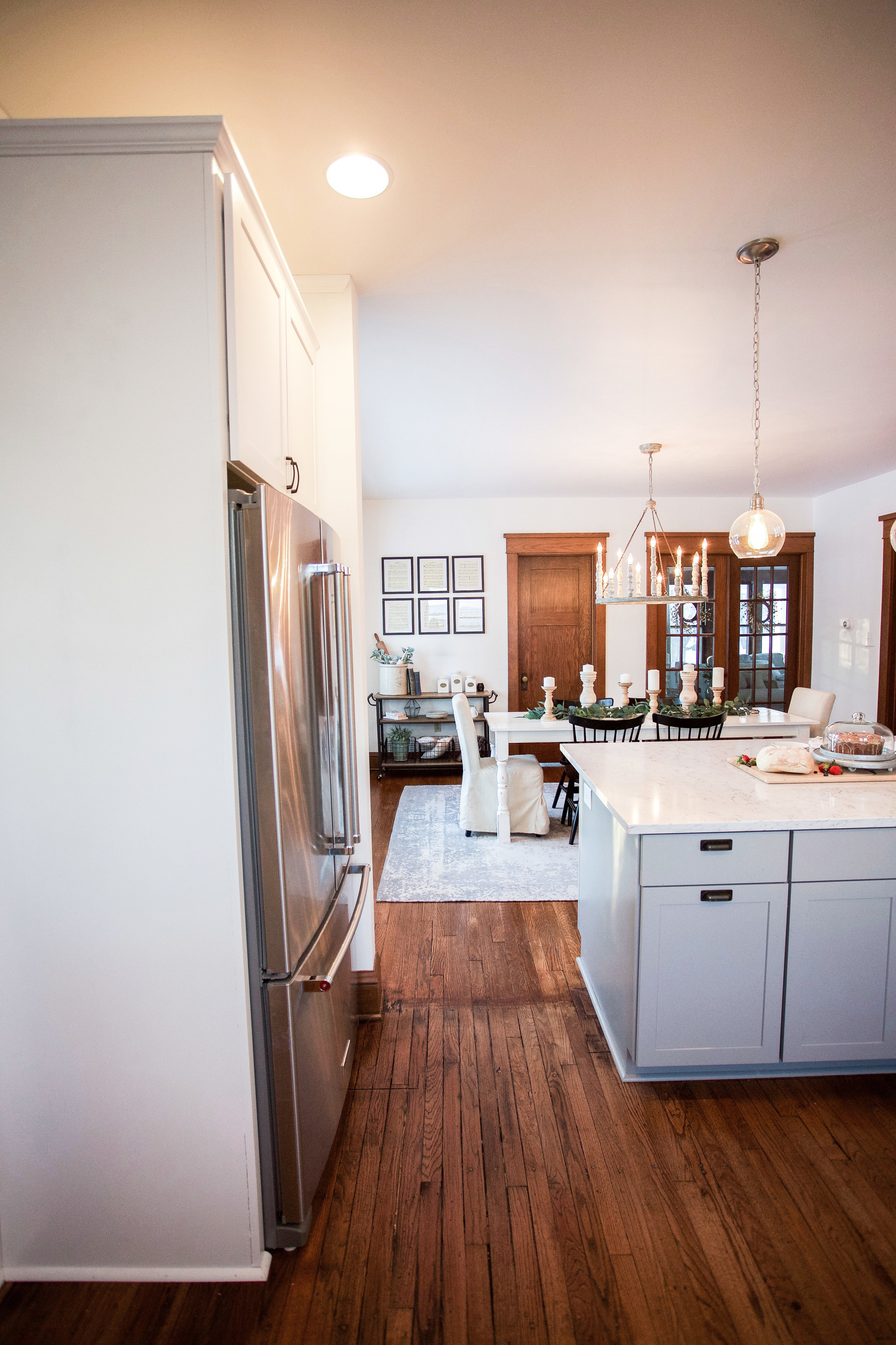
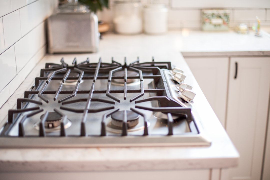
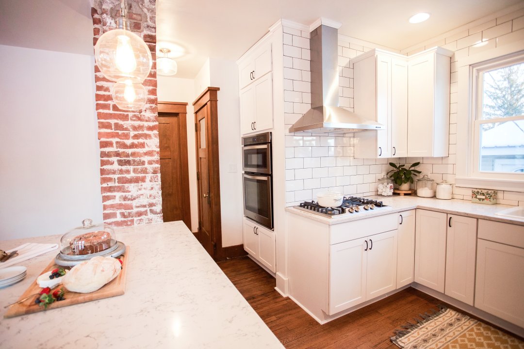
As for the stove top & hood vent we wanted to go for more of an industrial look to compliment the old brick, so we decided on the Whirlpool Convertible Wall Mounted Range hood in stainless steel. And similarly with the range, we wanted to keep that stainless steel look so we opted for this gas cooktop from Frigidaire for its efficiency and look.


As for the remaining appliances, keep in mind we are working with a rather tight space so we decided to remove the existing pantry and replace it with a large cabinet that holds this microwave oven combo from Whirlpool. Doing this decluttered our kitchen while still keeping it completely functional.


LIGHT FIXTURES
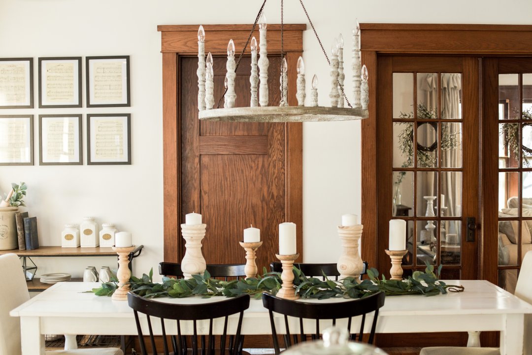
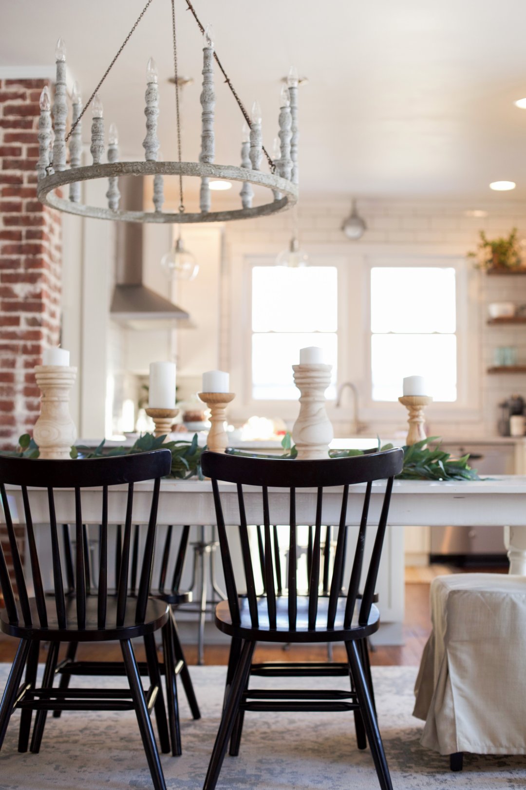
For the lighting I wanted it to be extremely unique/make a statement/be true to the farmhouse look. That's why when I came across this Norridge 15-light chandelier from Feiss, I literally couldn't help myself. I mean it speaks for itself...am I right???

When it came to picking out the pendant lights over the island, I found it insanely difficult to find something that complimented the space without clashing with the massive chandelier. Luckily, I found these Industrial Mini Clear Glass Bowl Pendants from Quoizel Soho; and they are the PERFECT balance for this space.

For the light fixture above the sink, I really wanted a wall sconce but one that looked like a tried and true barn light. This Portfolio Ellicott galvanized outdoor light from Lowes is a quarter of the price that many companies charge and it fits the vision I had perfectly.

OPEN SHELVING


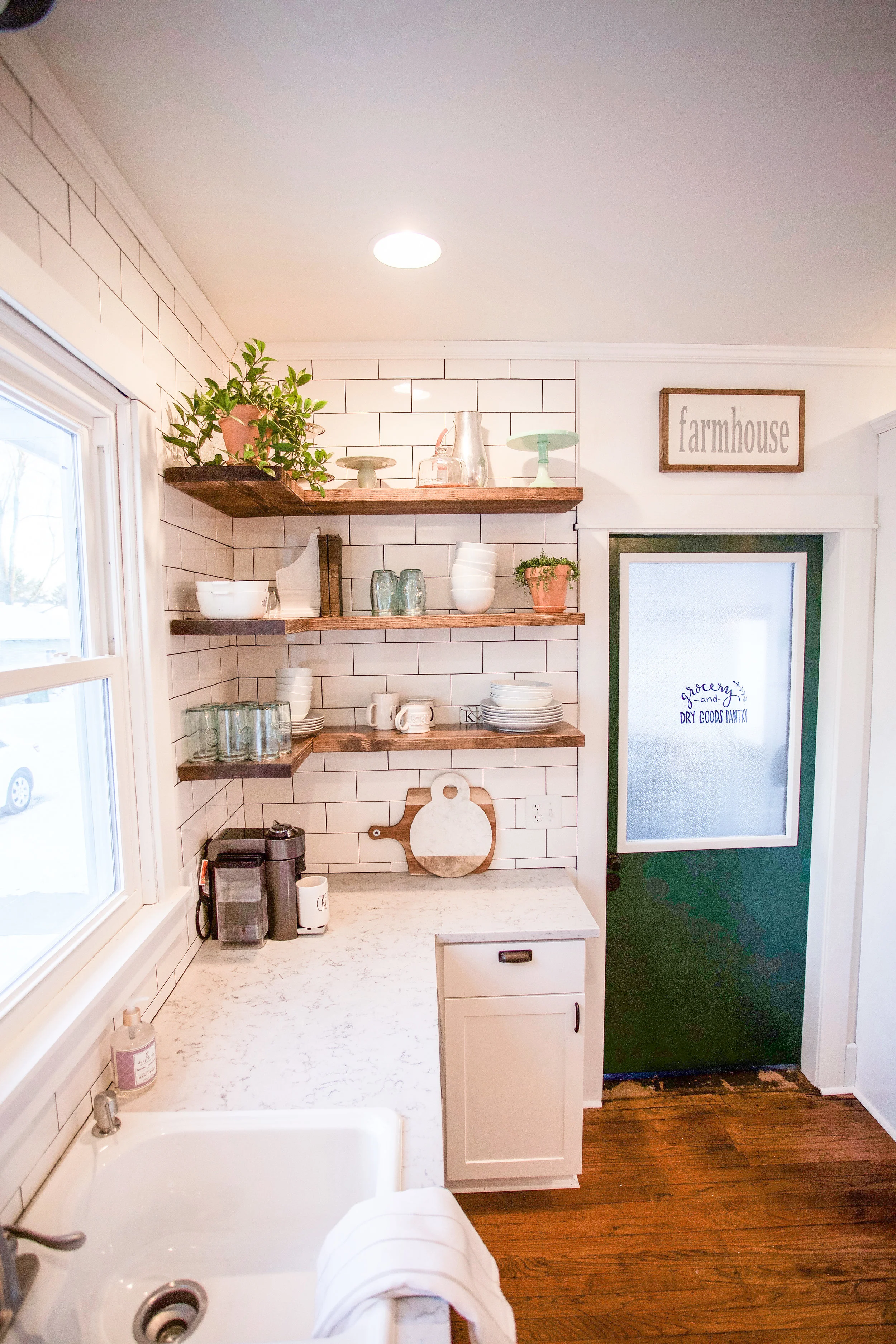
I decided early on that I really wanted open shelving but I had no idea it would be one of the biggest money savers during this project! I didn't want to have brackets so Guy found a technique that hides the brackets while still giving us a sturdy shelf (we'll have to do a DIY tutorial on that one soon). I am absolutely obsessed with how this part of the project turned out.
SINK, FAUCET, & HARDWARE

When picking out the sink, I knew I wanted something that was timeless, durable, practical, and of course consistent with the farmhouse theme. I love farmhouse sinks but to me, they aren't exactly practical for the washing & drying of dishes. I liked the idea of having two separated sides. So this white double-basin cast iron drop in from Kohler was the perfect choice. And man, that thing was HEAVY...but durable!
For the faucet, I wanted something that again, was practical for the daily washing & cleaning of dishes; this 1 handle pull down faucet from Moen did just the trick!
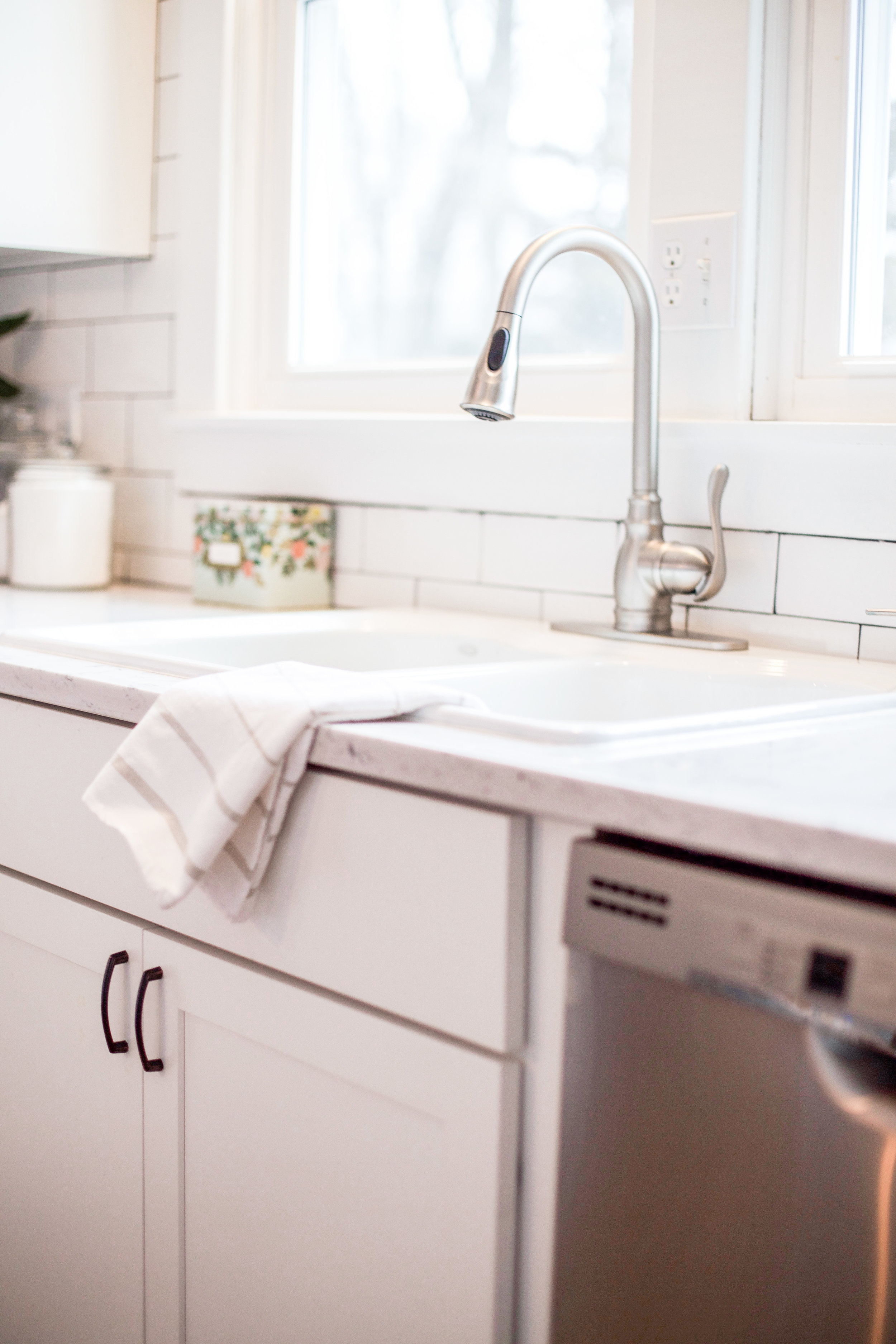
This is the first time I've done any dark colored accents, but when it came to this farmhouse feel I felt it was appropriate to bring in these vintage oil bronzed cup pulls into the picture and I absolutely LOVE how they turned out!

BAR CART
I wanted to add this Lancaster kitchen cart to bring 3 dimension to this corner of the room. And on top of it I used this space to display some pages from my mom's old song book that she used as a girl to learn to play piano. I love how each page has scribbles written in between each note and staff from her teacher. It's the perfect way to display such beautiful memories.


SHOP THIS POST!
I realize I didn't cover everything in this post, so you can shop the rest below!
Bar cart
Dining room covered chairs
Dining room chairs (black)
Hardware
Subway tile
Chandelier
Pendant Lightings
Barn Light Sconce
Large Area Rug
Counter depth Fridge
Dishwasher
Sink
Faucet
Hood vent
Gas Cooktop
Oven/Microwave Combo
*Lowes Home Improvement provided all the materials for this project.
As always, thank you so much for stopping by! If you are new don't forget to subscribe below!
xoxo, Tessa
PIN ME!


