ORC Week 2: The Plans For Our Dining Room
Welcome back!! Week 2 of the One Room Challenge is here (if you missed last weeks post you can find that HERE)! This has been such a fun and for real challenging endeavor as I look at so many other incredibly talented people that are participating in this and feeling a bit overwhelmed and inspired by all the designs. Since I’ve never done this before I feel like I’m doing things a bit more unconventional and sharing my plans on week 2 instead of week 1. But since I started on this makeover early (as in over a month a half ago) I feel like you probably already have a good idea for what we are trying to achieve in this space HAHA! Oh well! We are just going to roll with it!
The whole goal with this space is to simplify and declutter! Like I mentioned last week, we want this space to move from more farmhouse to mid-century modern with a vintage spin. And while I truly loved the look at design of what you saw in week 1, it truly wasn’t functional for our family. Having rugs underneath my table with four young children constantly spilling and dropping food was giving me anxiety and quite literally breaking my back!! And having the table in the center of the room created a HUGE obstacle when walking to the kitchen. While the design was aesthetically pleasing it just wasn’t functioning well for our family so we’ve been trying to think of a way that we can truly open up this space without changing anything structurally. Which I’ll share more about next week! In the mean time I wanted to share some cosmetic changes we’ve made to this space that have had a HUGE impact on the look and feel of the space, as well as, the overall look and feel that we are trying to achieve.
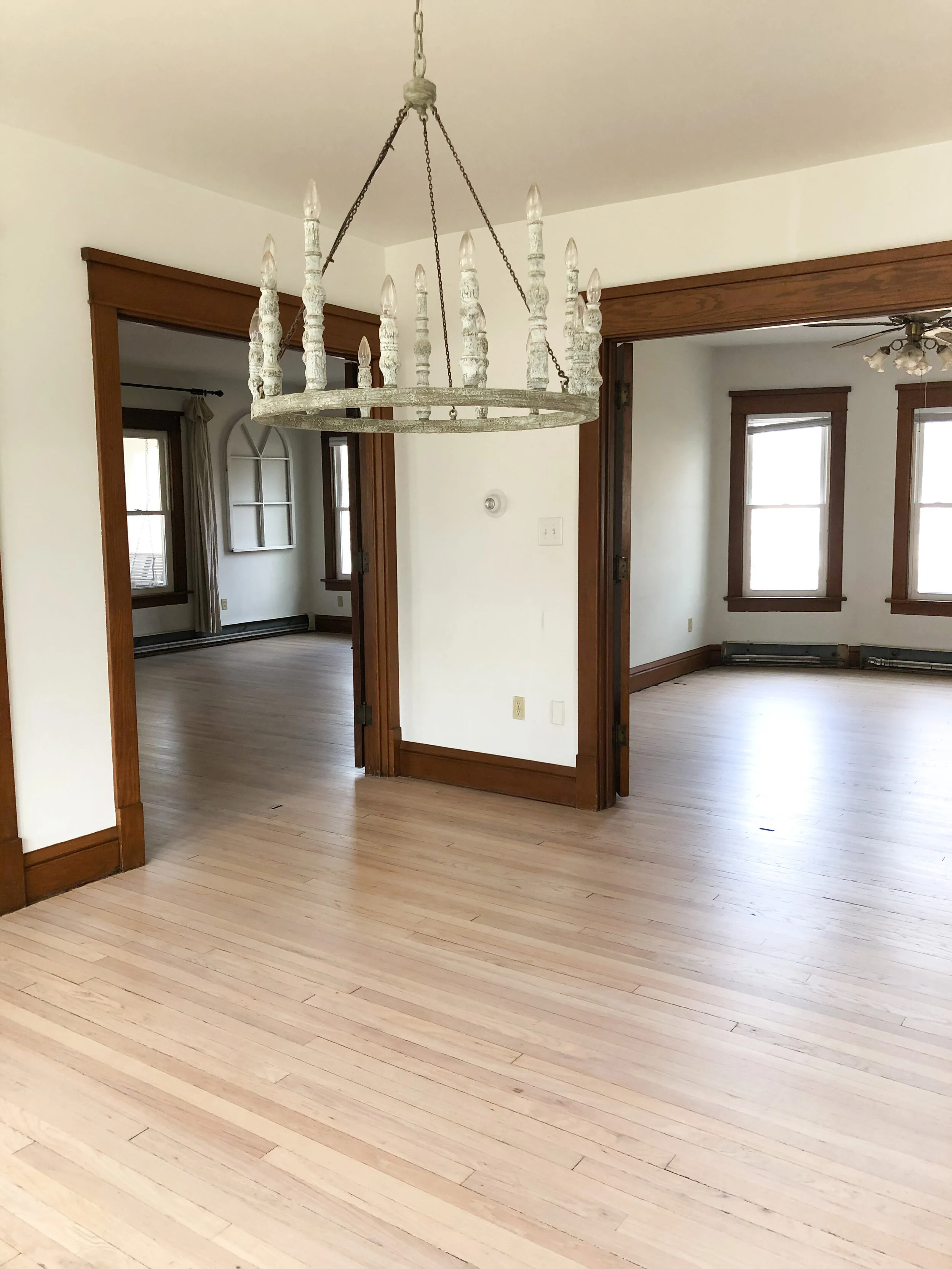
The first HUGE thing that we did was completely refinish our hardwood floors! My husband and I tackled this one week and man was it a GINORMOUS job! Our floors were so dark and in effect really blended in with the dark trim that we have. And since we decided we aren’t going to paint the trim, we decided that the best way to really brighten up the space and create more of a contrast would be to lighten the floors. We are actually in the process of creating a tutorial right now on how we achieved this more natural wood tone look. Here’s a fun look into that whole process HERE.
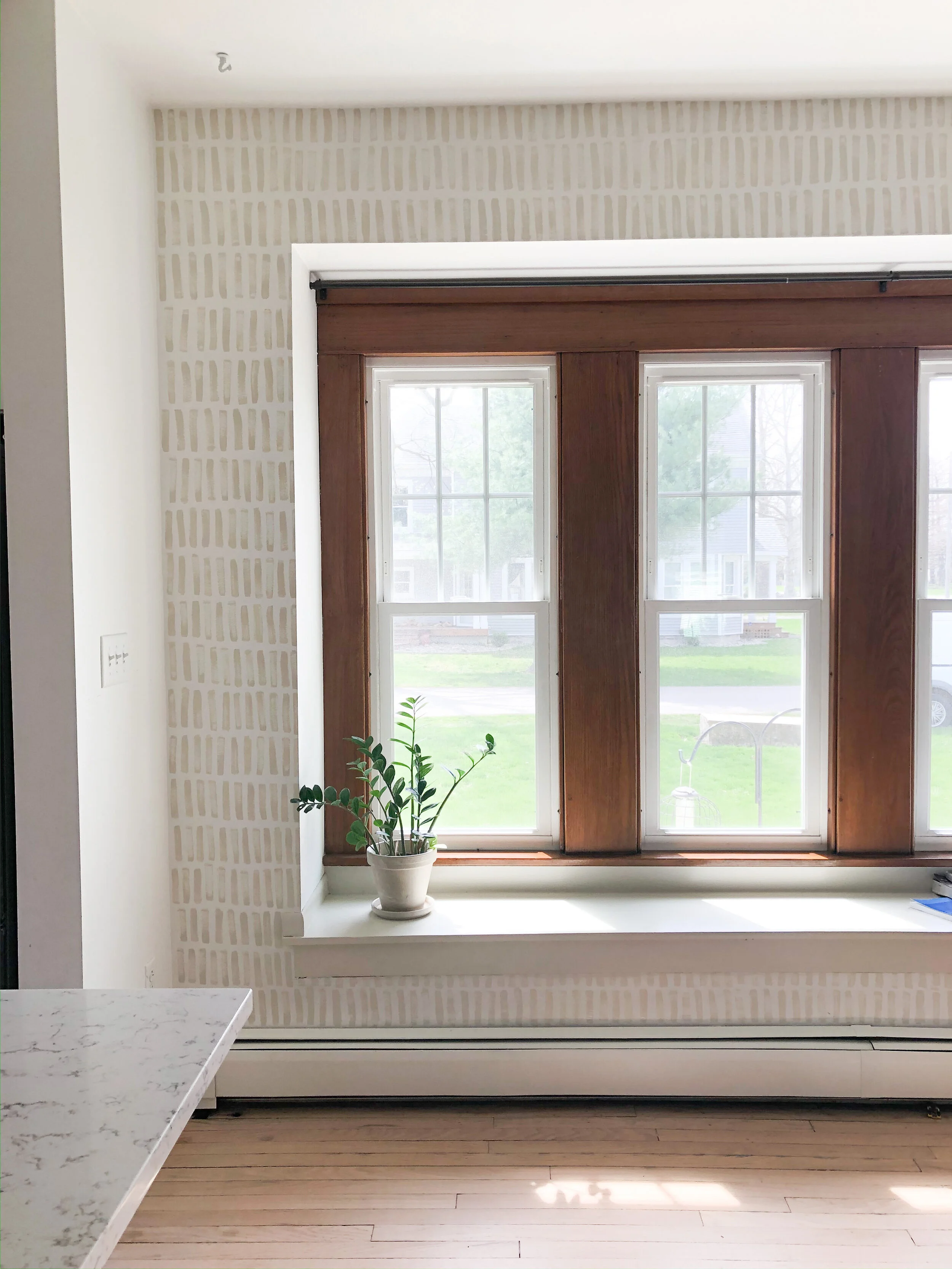
Another thing we changed was we painted the window seat that lines our wall of windows in our dining room. This bench was ROUGH and had multiple points of damage and decay from the previous owner leaving pots on it, creating water rings and marks.
We quickly sanded it down, filled in the large gaps between the planks with wood putty and put on a fresh coat of BM Baby Fawn. While I was at it, I thought I’d accent this space a little more by creating an accent wall around it. Using the left over paint I had from the bench I used an old kids paint brush I had laying around and painted on a fun stencil “look-a-like” to give this space the extra attention it deserved!
I could not be happier with how this all turned out! It truly makes such a difference to the look and feel of this space. Stay tuned for what we uncover next week!!


