House on Hillside
Hi there friends! If you’re new here, well then HELLO!
My name is Tessa and together my husband and I run Kindred Homestead, a home flipping and interior restoration business in Central Illinois. Together, with our 4 children, we hope to create a space for our home (and the ones we renovate) to reflect not only who we are but also to help make design more approachable for YOU as well.
This past year we flipped a little 70s styled mid-century modern home that had taken quite the beating over the last few decades and while many people would see this house as a HUGE project…we saw the raw potential it carried. So with no further adieu here is our House On Hillside.
When we first bought this house the kitchen was strangely located in the corner of this rather large room, making it extremely disproportionate and crammed. We envisioned opening up this space, flipping a few things around (ok…or just the entire kitchen) and giving this space more intentionality.
BEFORE
AFTER
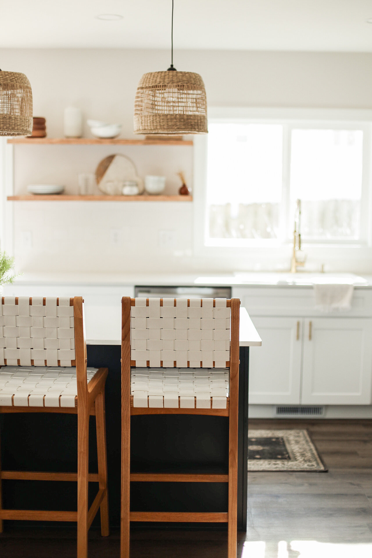
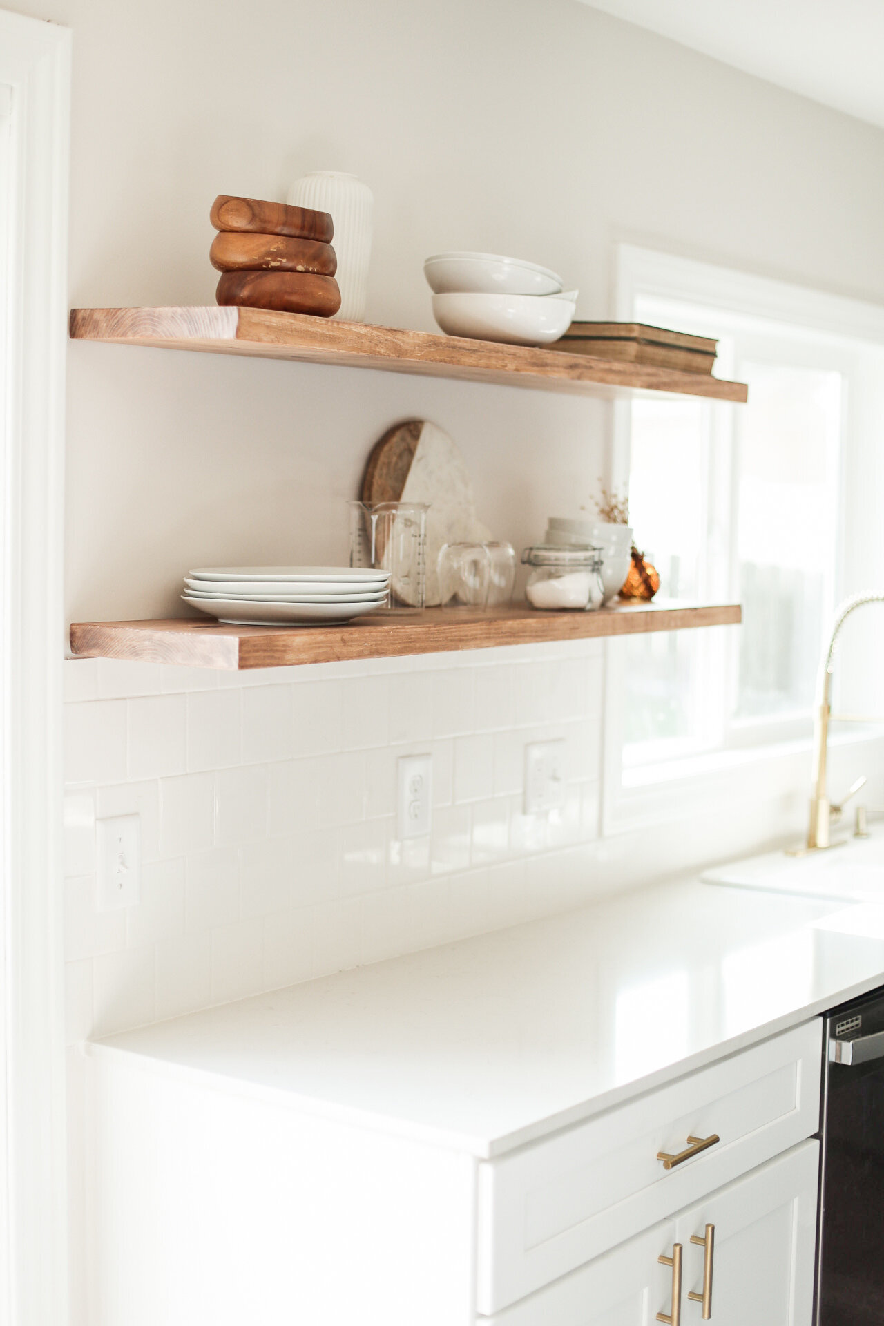
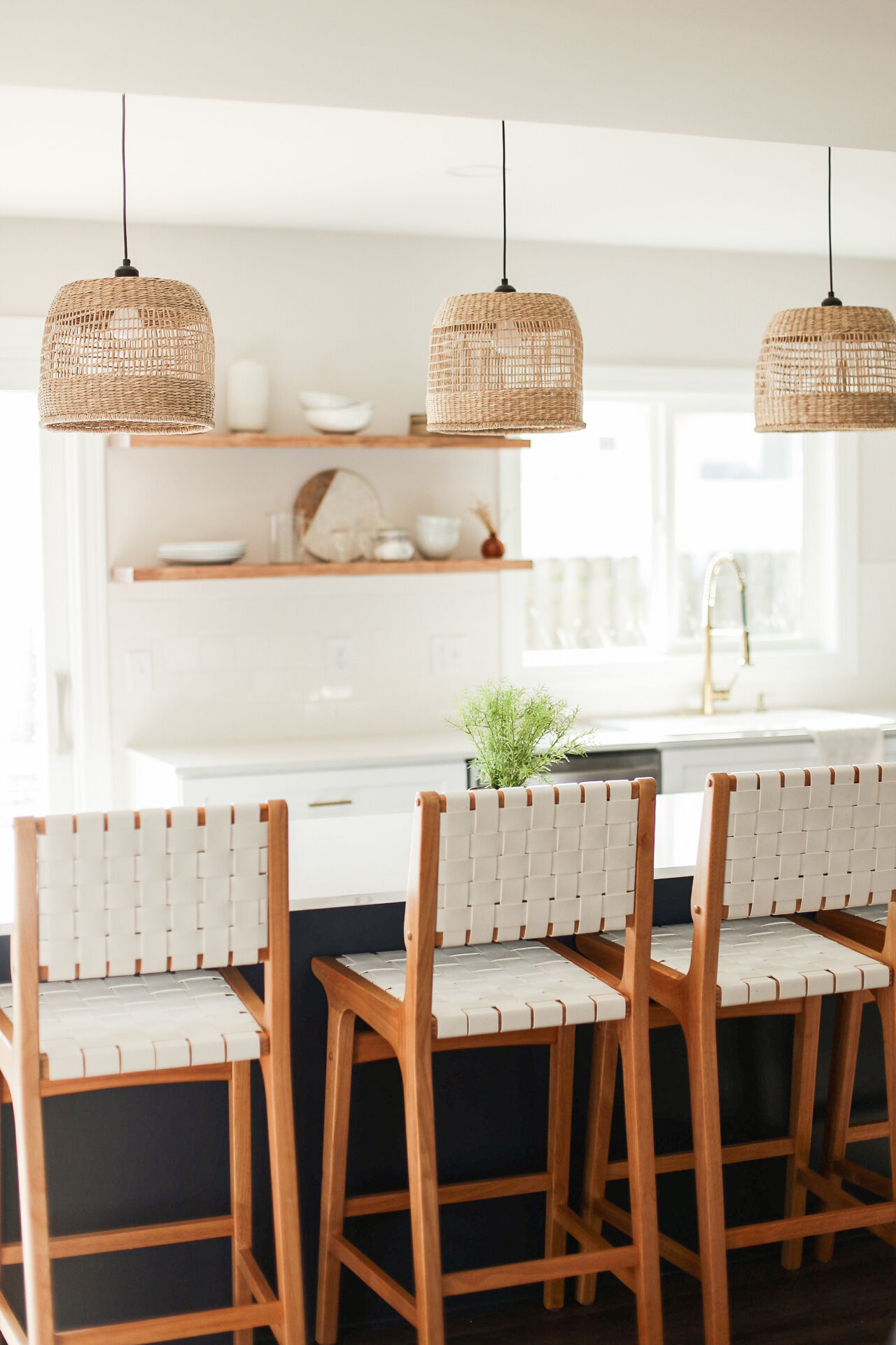
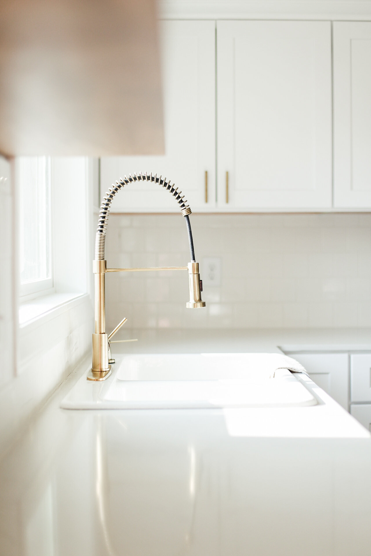
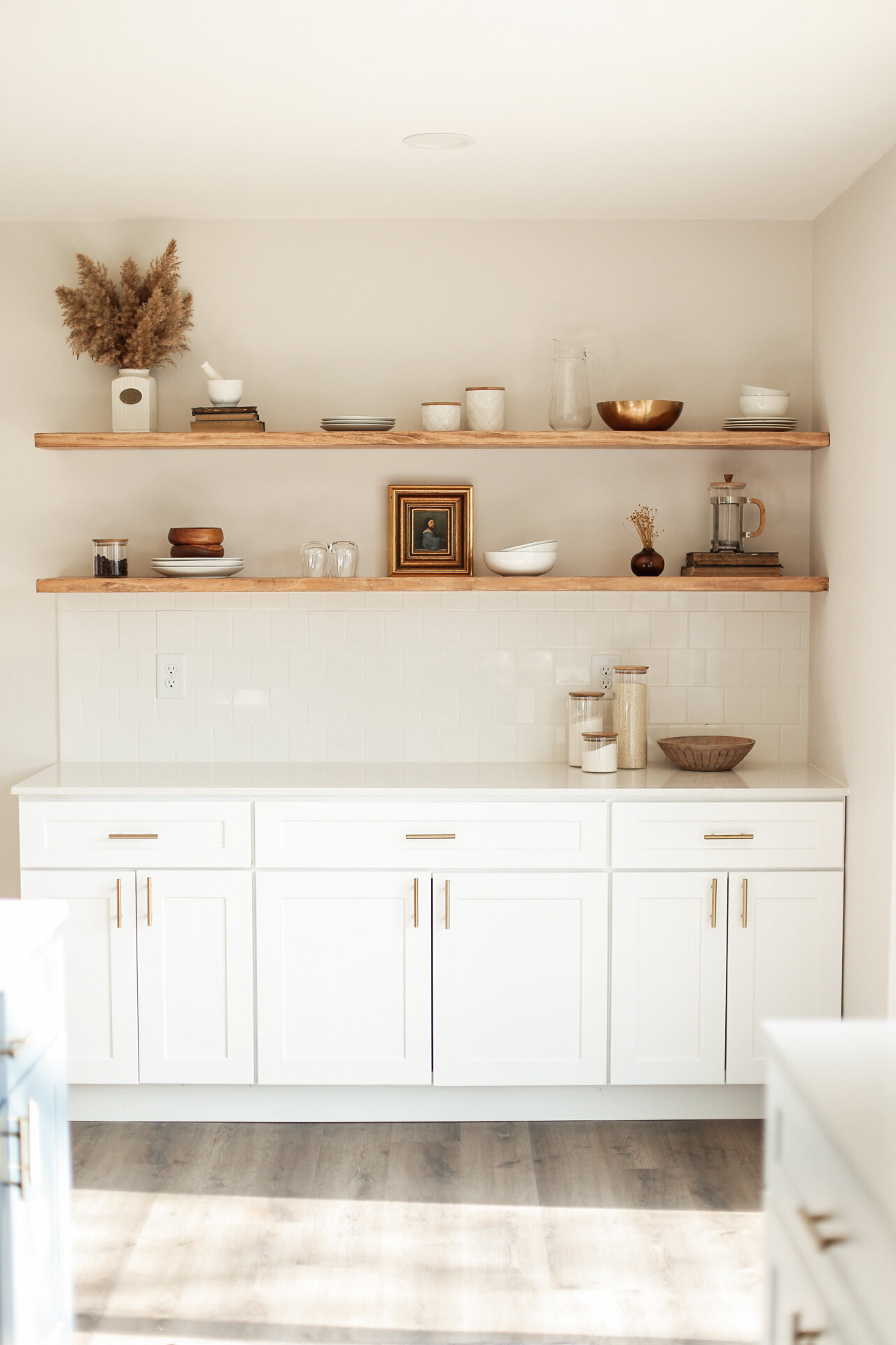
This transformation completely changed the look and feel of the entire kitchen. For obvious reasons, it opened everything up in this space, giving way to a much more natural flow of things. We went with a navy blue island and white quartz countertops to tie in to the 4x4 subway tile backsplash surrounding the entire kitchen. More than anything, we wanted this kitchen to transport you from Central Illinois, to a place that spoke a much modern, open, and classy language.
We did this by going with a very bold yet timelessly coastal color palette, tying in the seagrass pendant lights and white on white backsplash; contrasted with the natural wood open shelving and brushed brass fixtures throughout.
Shop some of our favorite kitchen items below!
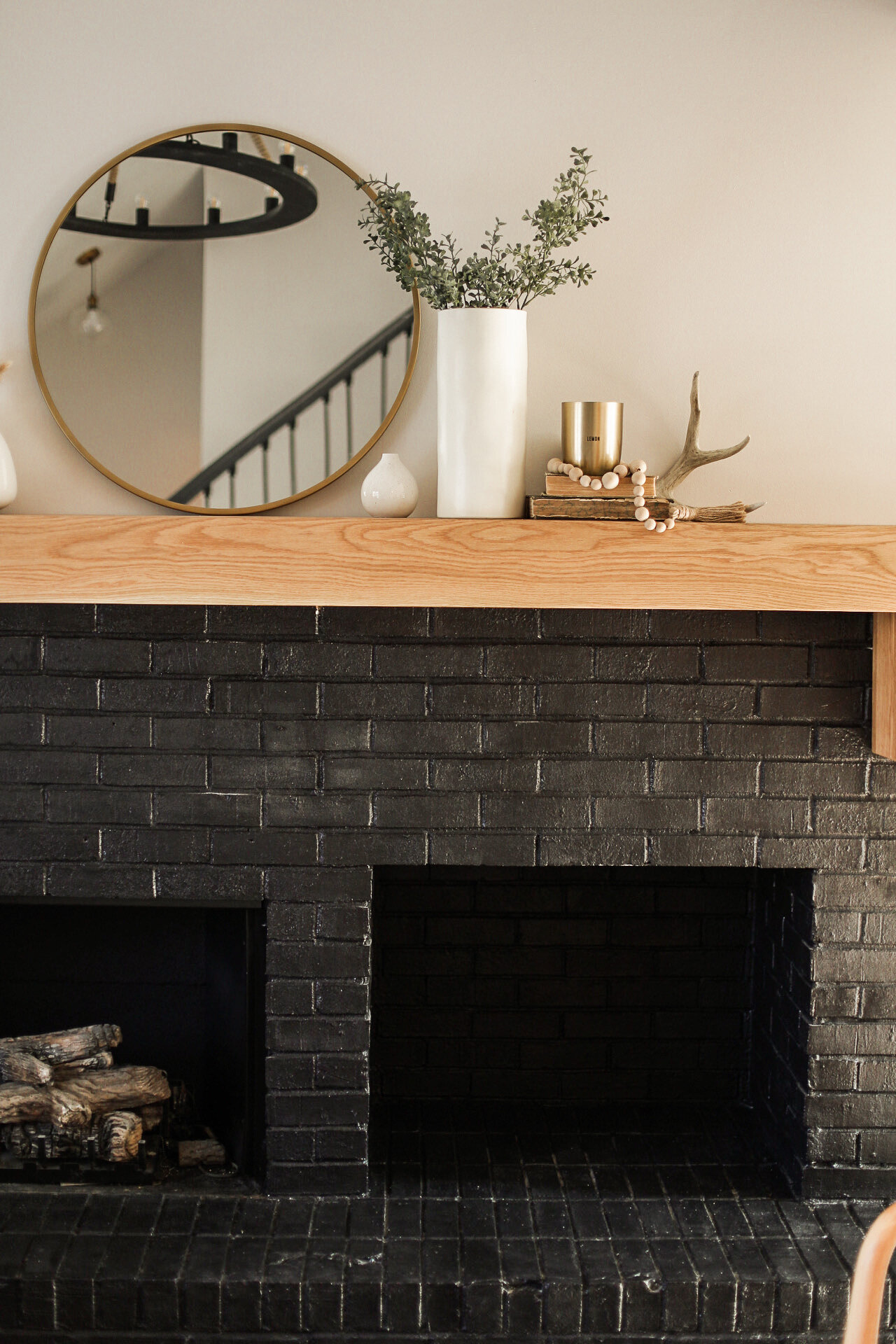
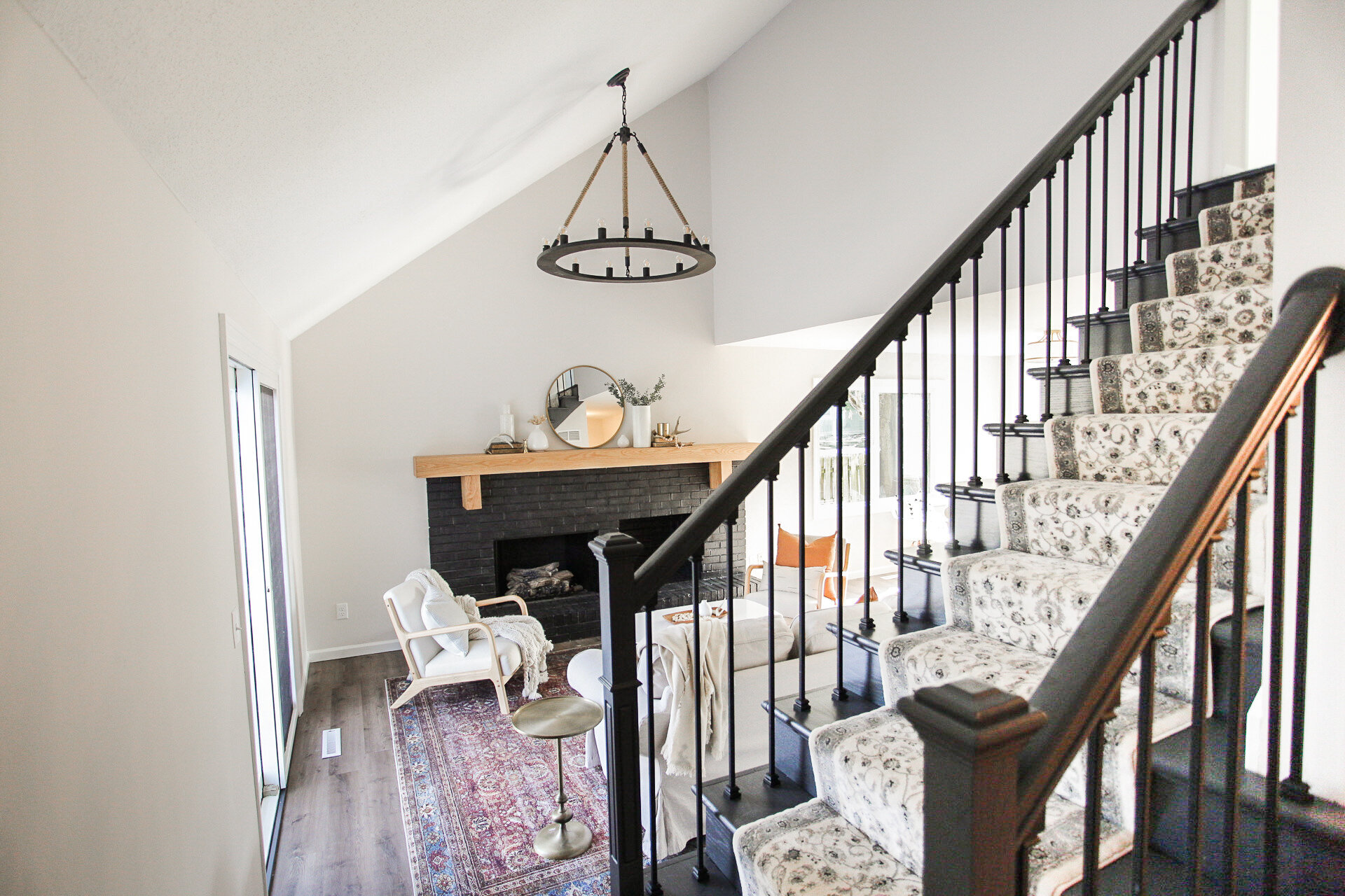
When we started renovations on the living room, our two main focuses were the stairs and the fireplace. We knew that with the vaulted ceilings and the large asymmetrical fireplace, this room could be “the place” to be but we had to make it stand out. And for me, that only meant one thing….adding a black fireplace!
We used the color Tricorn Black by Sherwin Williams for the fireplace, Eider White by SW for the walls, and Snowbound White by SW for the trim. These griege undertone white walls give this space just enough of that subtle contrast while keeping this fireplace the main focal point of this room. We also added in this circular chandelier to draw your eye up towards the vaulted ceiling, while still tying in accents of the fireplace and stairs.
BEFORE
AFTER
Our Loloi Rug & modern chairs can be found below along with a handful of our living room favs.
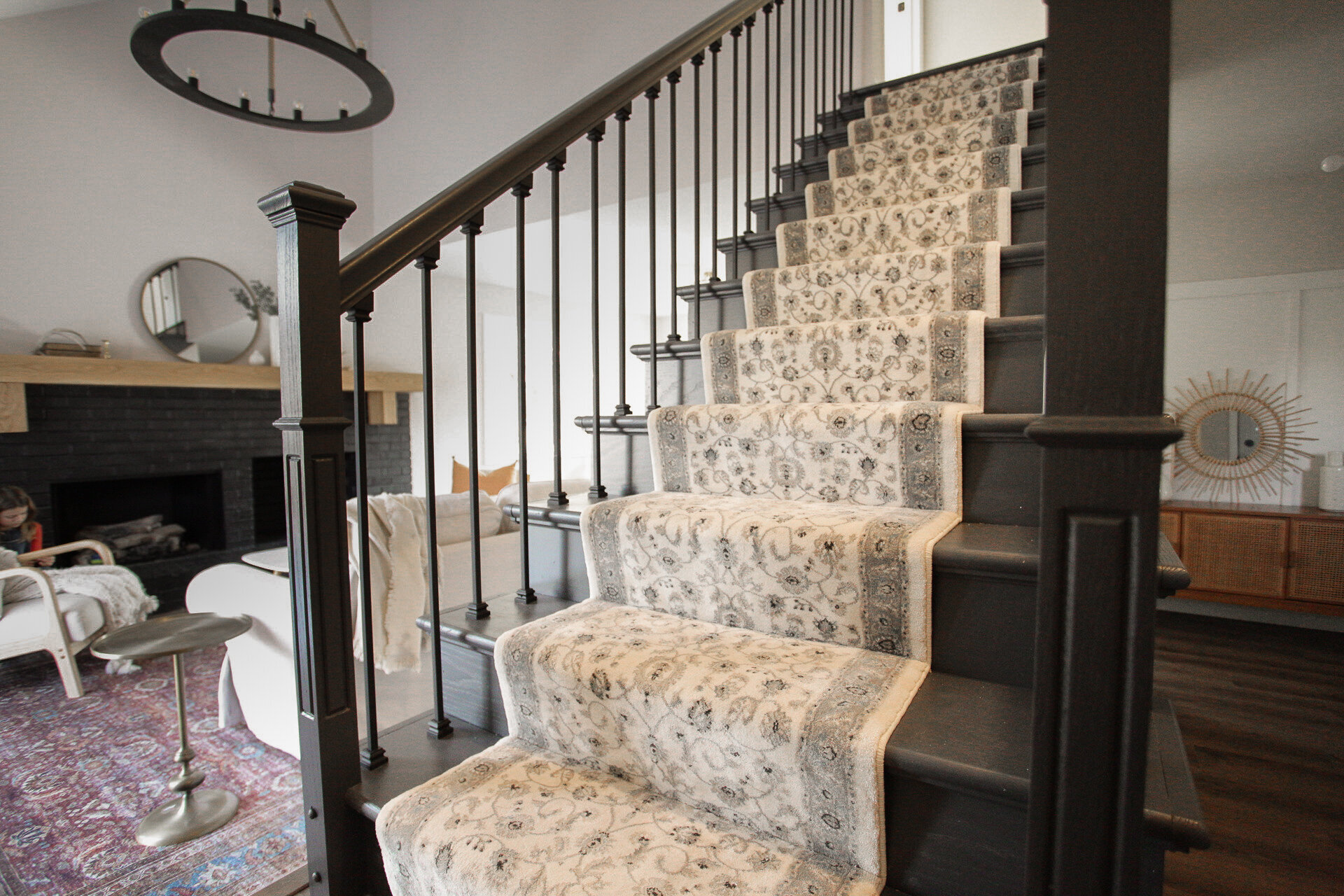
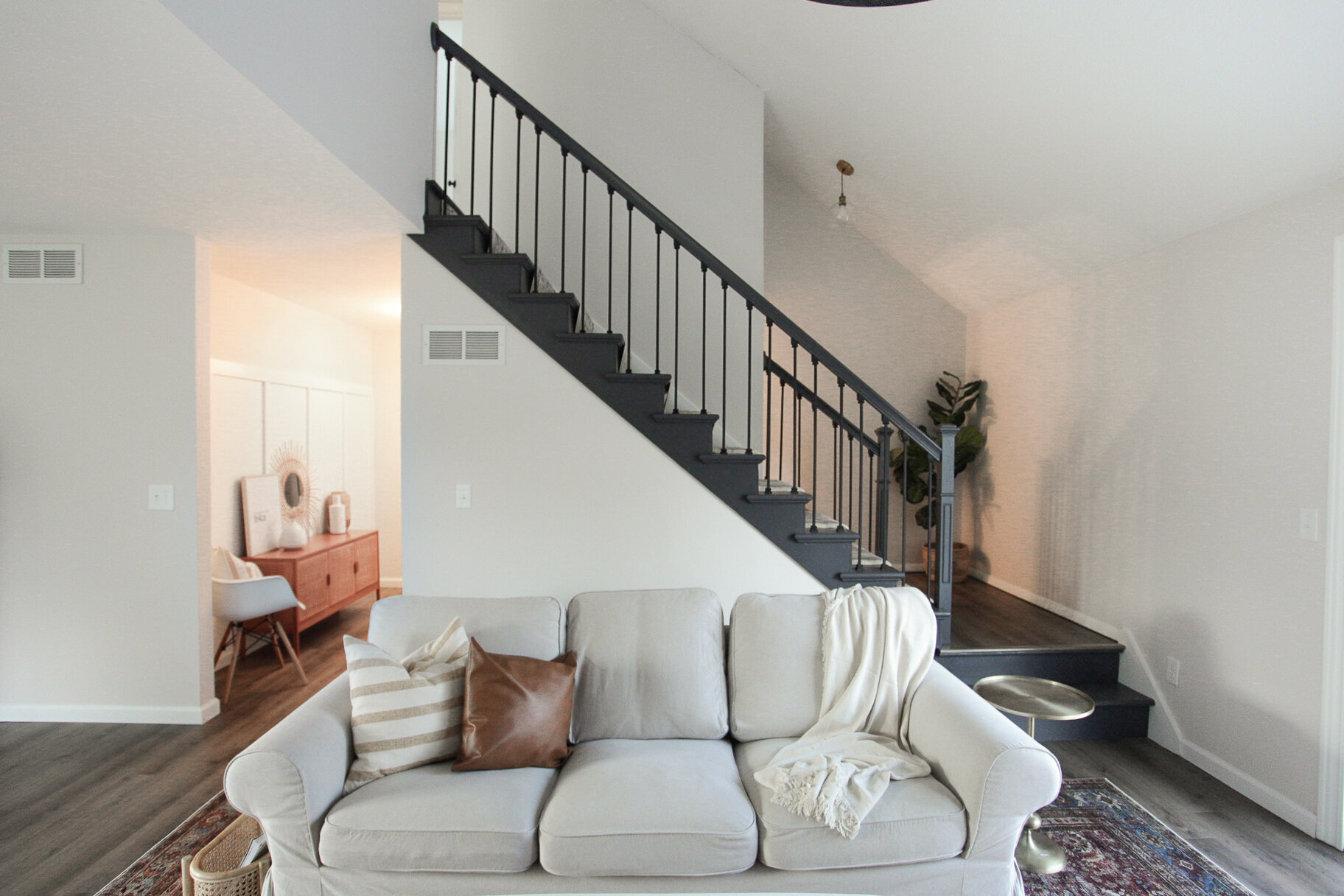
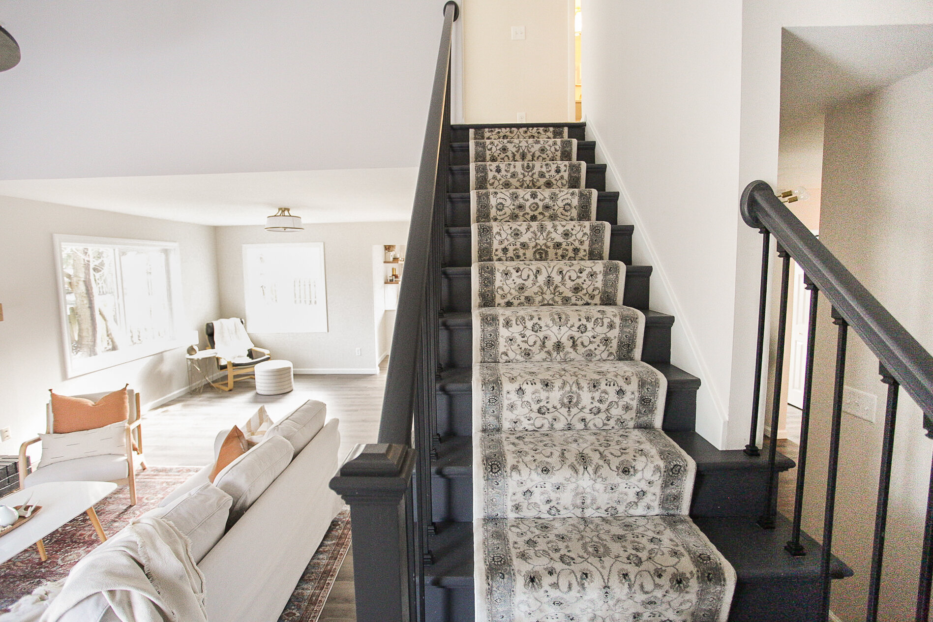
The stairs in this room had been hacked by a machete or something of that liking when we bought this property so we obviously knew that had to go! But other than that, we really wanted these stairs to be a fun accent piece in this room, to play off the fireplace and add a little character of its own to the space as well. So we added some linear modern metal spindles, paired with a vintage patterned runner to accent the charcoal colored stair treads.
BEFORE
AFTER
Come check out the House On Main Street that we flipped last summer! You will not believe your eyes when you see this transformation!
As always, thanks for stopping by! If you want to learn more about the services we offer head over HERE or feel free to email us at hello@kindredhomestead.com.


